


PulsarAudio player for publishers
- Role
- Product Designer & UX/UI
- Team
- Solo
An audio player that earns its place in the article
Pulsar creates immersive listening experiences, by placing podcasts in context - between articles that users are reading, transporting them into a captivating world of audio content. I designed a new set of fully adaptive players to address their needs and their client's requests.
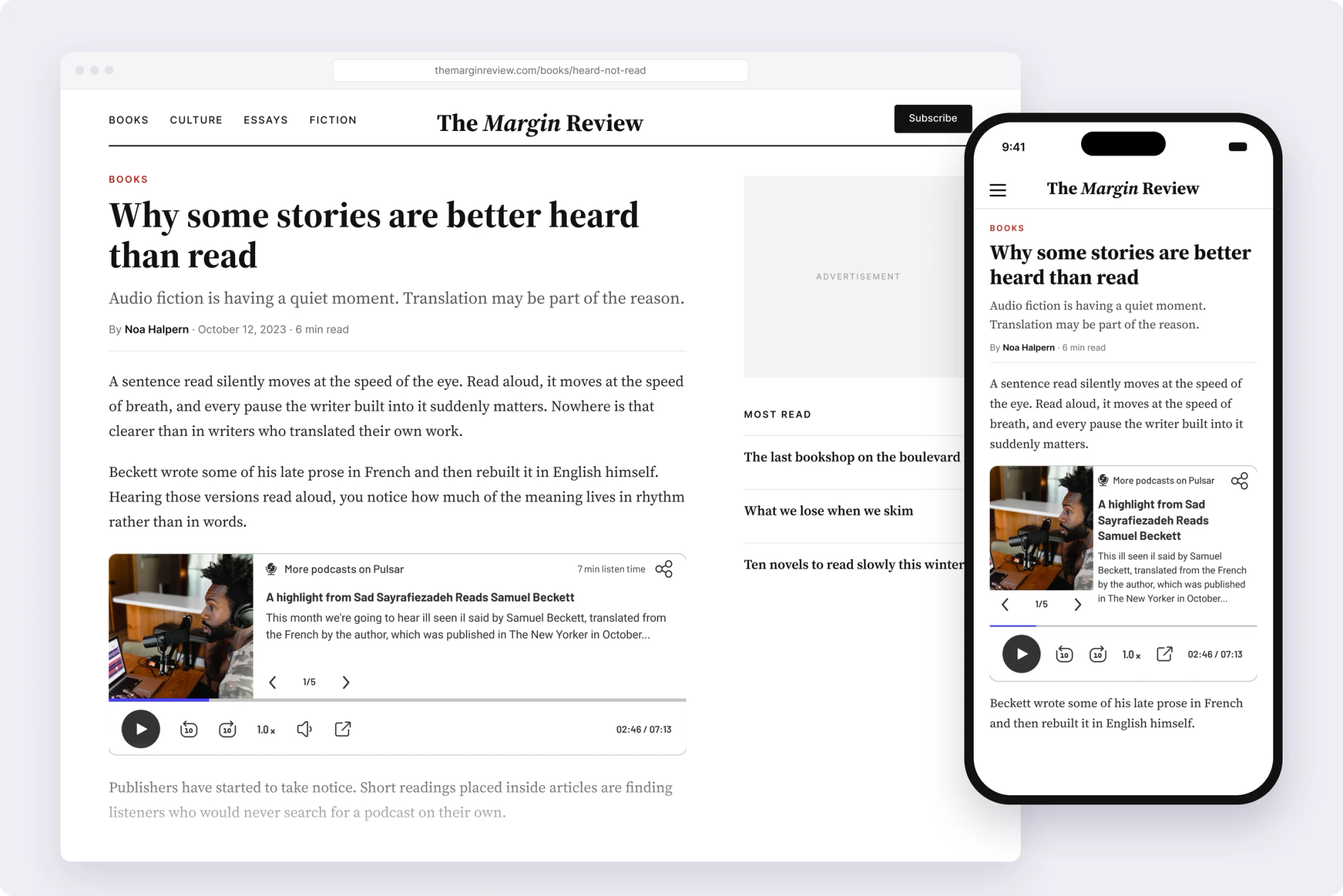
Two clients who wanted opposite things
The player had to satisfy two sides at once.
- Publishers are very protective of the content page. It’s a balancing act of reading experience vs monetization. Anything in the main column pushes the article content below the fold. Anything that interrupts reading or “steals” attention creates friction. The design of the player needs to be both seamless & engaging, two things that contradict one another.
- Pulsar’s team wanted as much functionality in the player as possible, fully responsive on every screen, and a link to their site to increase brand awareness.
More features means a bigger, busier player, and publishers want the opposite. Every decision came back to that trade-off.
The old player fought the page it sat on
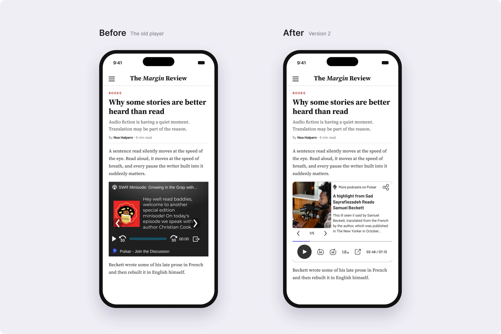
In the original player, the episode description sat on top of the cover art, and the carousel arrows sat on top of the text. The controls were small and low-contrast, and the Pulsar link was barely visible. It had one dark look, whatever site it landed on. On a light reading page, it looked like a foreign block dropped into the article.
Three decisions that served both sides
- 1. A player made of two parts. I split the player into an info component (episode, description, navigation between episodes) and a player component (play, skip, speed, progress). Each has one job, so the hierarchy stays clear even with a lot of functionality packed in. The same structure rearranges cleanly from desktop to mobile.
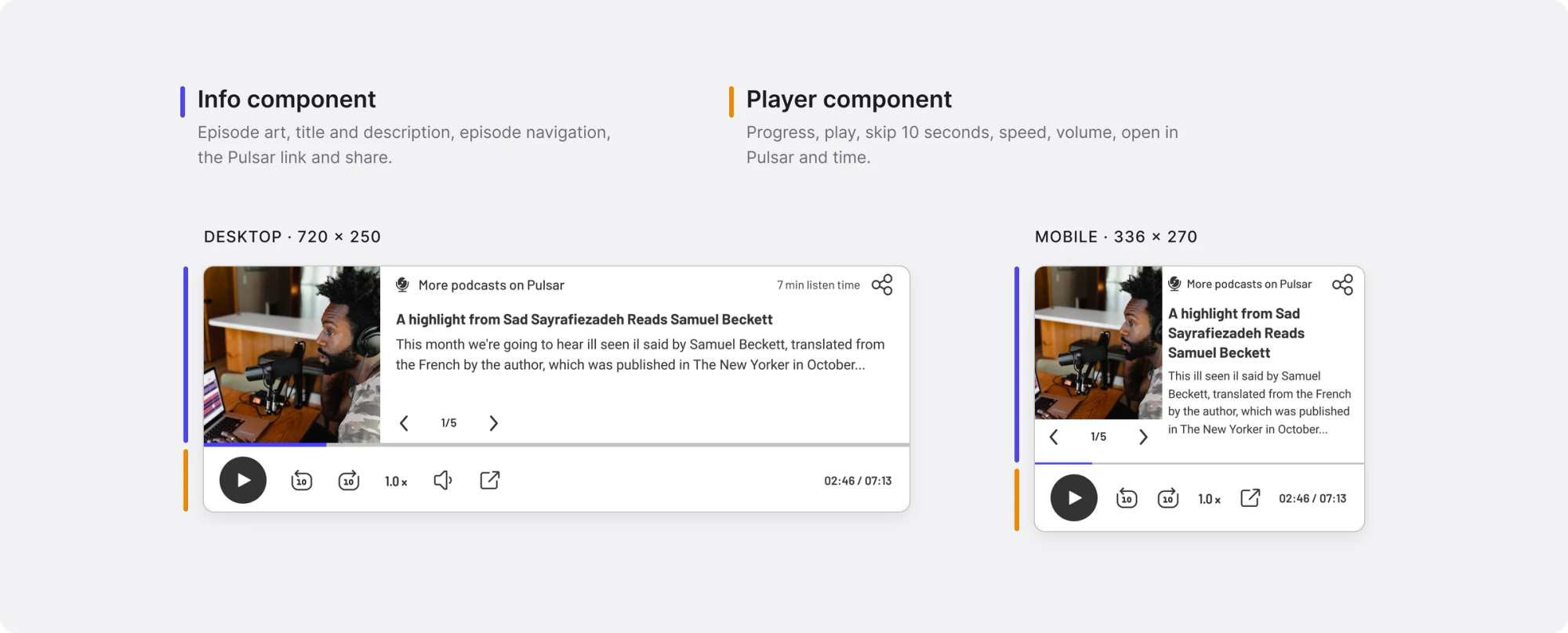
- 2. Sized to ad slots. Every size of the player fits inside a standard ad placement: 300×250, 336×280 or 720×300. Publishers already have room for those slots in their layouts, so the player can go where an ad would go, and earn like one.
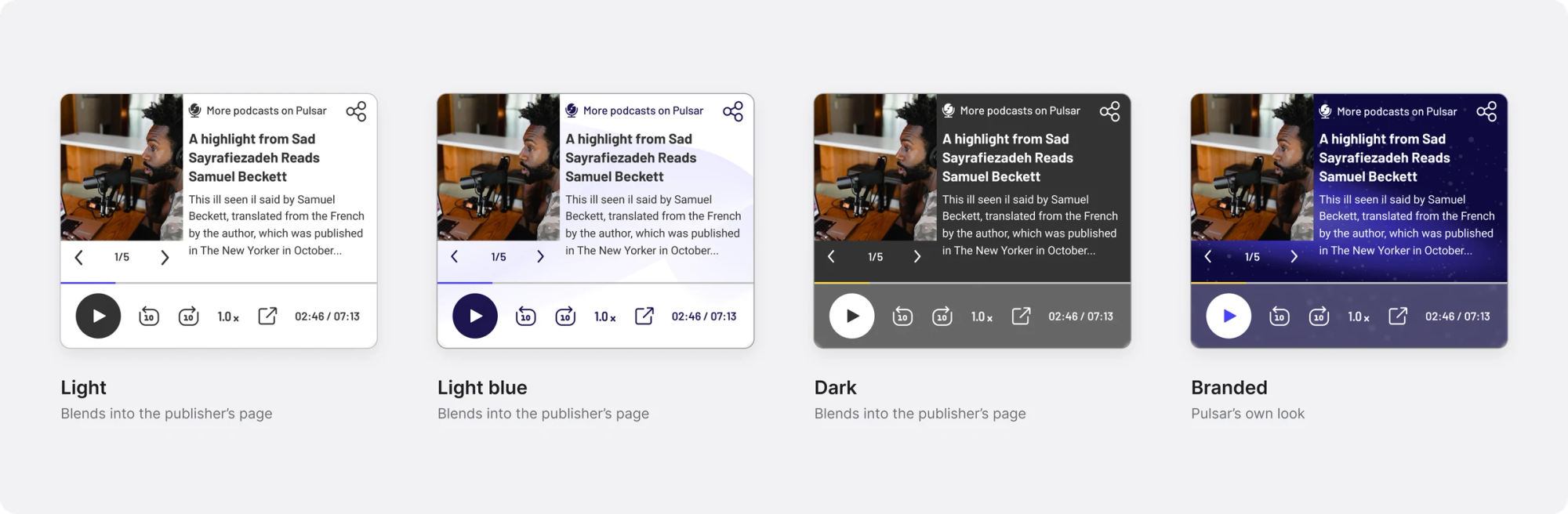
- 3. Themes that fit any site. Dark, light and light blue themes help the player blend into different publishers’ pages. The branded theme does the opposite: it carries Pulsar’s own look, so the player works as an ad for Pulsar itself, which serves their brand-awareness goal.
Three versions, three answers to the trade-off
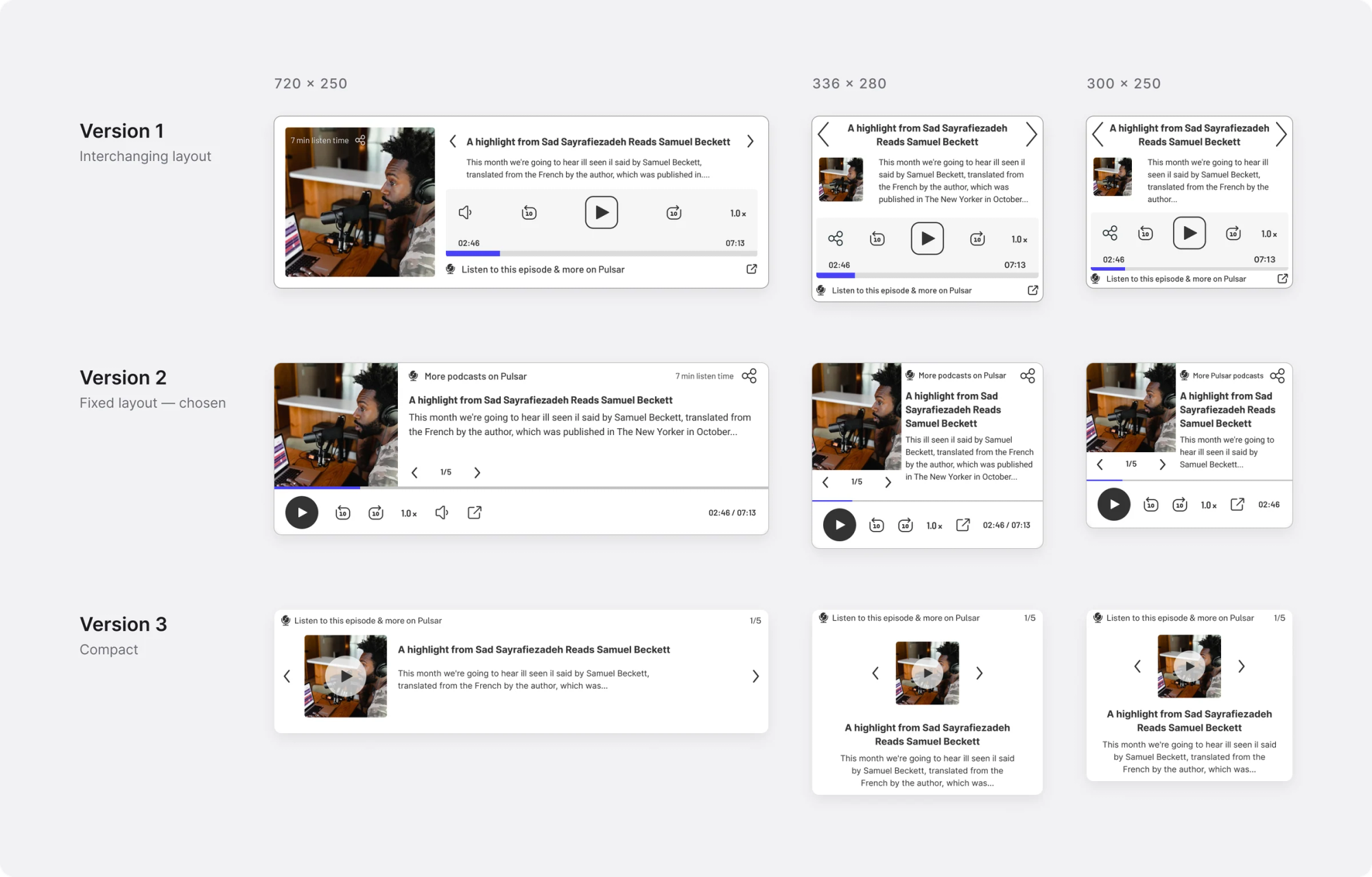
I gave Pulsar three versions to choose from. Each one weighs the same trade-off differently.
- Version 1, interchanging layout. Episode info above, controls in their own panel below; the image moves to the side on desktop. Gives up image size on smaller dimensions, and a clear repetitive hierarchy.
- Version 2, fixed layout. Image and info side by side, one full-width control bar underneath. Gives up text size and capacity.
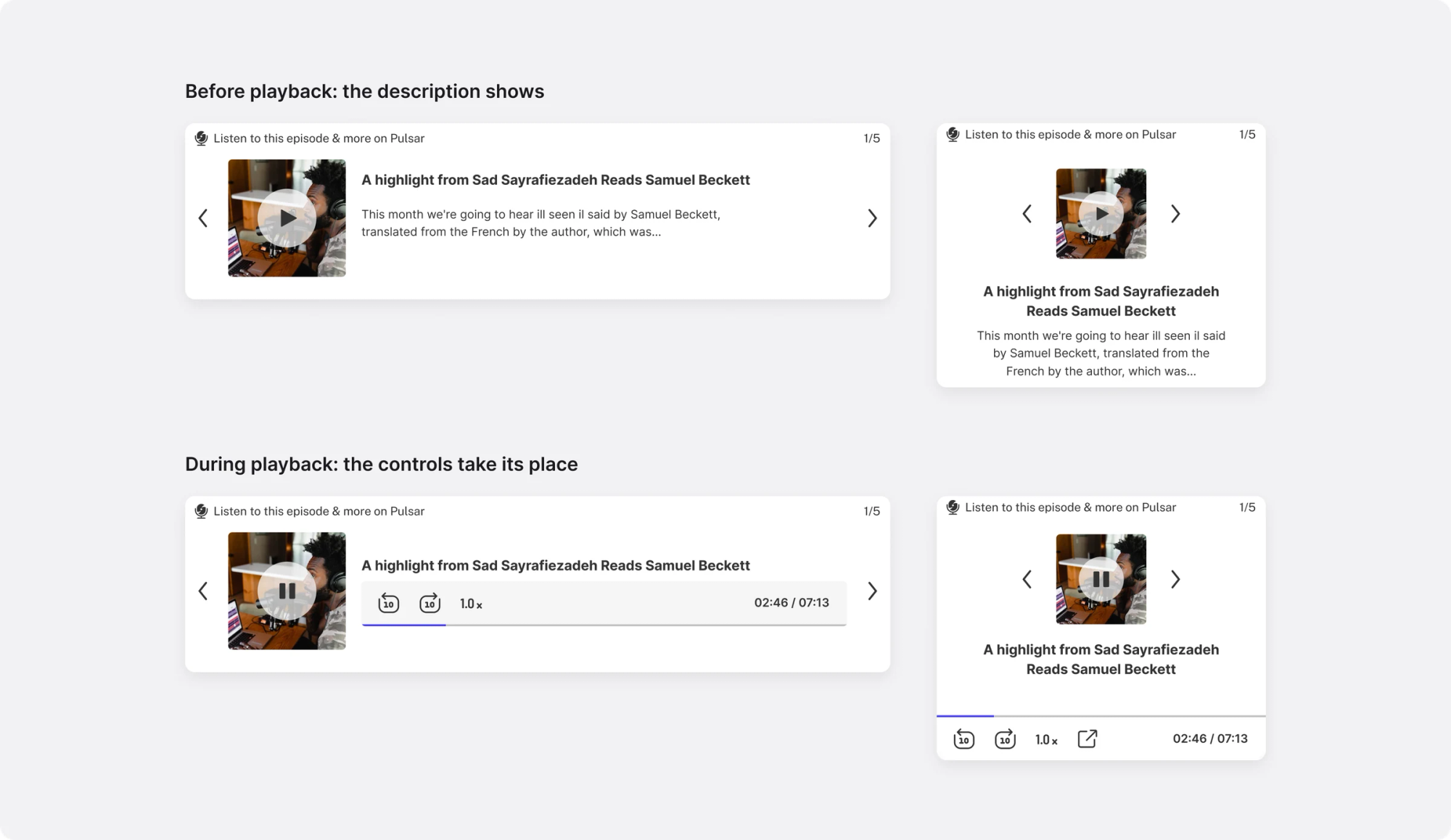
- Version 3, compact. Play sits on the thumbnail. When playback starts, the description gives way to the controls. Text and controls are never shown together.
Outcome
This was a short product sprint. Pulsar was happy with the work, took version 2 forward with their own team and shipped it.
Version 2 was chosen because it’s the most balanced solution. The image stayed relatively large in the composition no matter the player size, the title & caption were visible on all player sizes, the layout was consistent on all player sizes, and it was optimized for updating and adding features.
If I’d stayed on
I’d measure play rate per page view and listen-through for each theme, and test whether the branded theme earns more than a standard ad in the same slot. I’d also run A/B tests against the third option’s layout to see which one drives more engagement, and the CTR for the link.